Now, I could have simply slapped the label “Makeup Brush Washing Machine” on this invention of mine and tried to bring it to market.
But what fun would that be?
And, without a doubt, one of the more fun parts of this whole project was developing and executing the branding of My Brush Betty!
While I waited for the engineering work — and my first prototype — to be completed, I really got cracking on my branding.
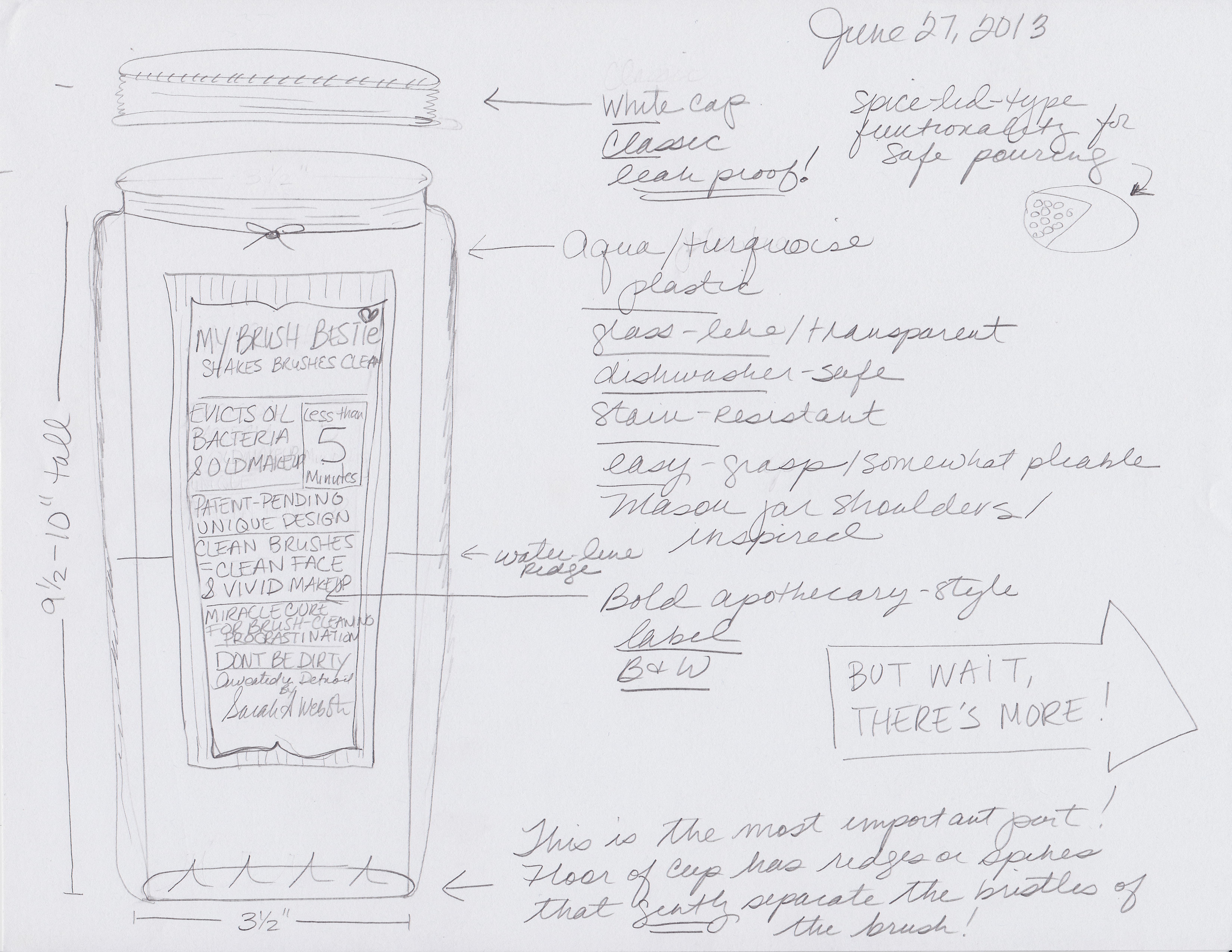
I started with the working name My Brush Bestie in June of 2013. I ran hard and fast with it for about six weeks before I decided it, well, sucked. Eventually, I switched over to My Brush Betty.
And truth be told, the effort I put into branding wasn’t all about fun–it was also about trying to command the highest price possible. Not because I’m greedy, but because My Brush Betty is so relatively large — in terms of height, width and weight — that I knew that the shipping charges were going to be very expensive.
If covering businesses, and specifically the auto industry, as a journalist for years had taught me anything, it was that branding is immensely important, no matter how small the product, in determining how much price one can extract at retail.
Eventually, I decided that I wanted the My Brush Betty brand promise to be smart (with some science to prove it!), pretty and a little bit sophisticated and sassy. I created a logo, complimentary artwork, a style template with colors and fonts and I decided to stick to it to keep a consistent brand.
You can click on the thumbnails at right to see the stages of creative development.
Give it Time
Developing a brand is sort of like developing old-fashioned camera film: It can take a while for the picture and messages to become clear.
You have to take that into account and really work on the development to see where it goes, which is usually more powerful than how it started. You have to think about it, poke it, squeeze it, and prod it until you are 100% sure it’s right.
In my career, however, I’ve seen people cut off development time too early on branding projects and not let ideas percolate or wash over the film long enough for good ideas to crystallize. I knew I didn’t want to do that, and so I really, really put some work into the concept. That usually means a lot of revisions and not getting too stuck on your own good (or dumb) ideas.
So even though I spent money buying some URLs and investing in some creative work around “My Brush Bestie,” which in hindsight was a terrible name, I don’t consider it a waste. It was an important part of the development.
Because I had already decided on a retro-y Mason-style square container, I knew I wanted the theme to feel a little vintage. In studying the marketing for other makeup brush care solutions, such as the Sigma Spa Brush Glove ($35), the Brush Guard Kit ($38.95) and the Brushbie ($18.85), the marketing felt adolescent and a tad preachy. As in: Don’t you know you should be cleaning your brushes?
My marketing research showed women already knew that, but weren’t doing it simply because there was no easy way to do it. They also weren’t feeling great about using a dirty brush — there was anxiety there — but they just didn’t have many better options. I also learned women didn’t like the idea of using expensive consumable cleaning products, such as tiny $12 bottles of brush cleaning spray.
The marketing on the competitive projects also felt a bit fleeting, like it could be here today and gone tomorrow. I wanted to aim for something more lasting and “sticky” in terms of imagery.
Given the retro feel of the product shape itself, I knew I wanted an old-fashioned kind of label with some vintage-style advertising to boot, like the labels on old apothecary type products.
When I got started on the branding, I was very focused on the “how it works” part of My Brush Betty and was a bit overly focused in the creative on bathroom imagery and water and waves–as you can see in some of the first labels here.
But, all in all, it was pretty uninspiring. And brush cleaning is already pretty uninspiring. So I didn’t want to add to that problem …
At some point, I decided I needed to try to make this process a little more fun. After all, this product was challenging conventional wisdom that a makeup brush shouldn’t be submerged in water, which is sort of sassy!
Figuring out the personality of your brand and what it stands for is part of developing the creative imagery, and I was still figuring it out …
I started kicking around a lot of different names and ideas, and eventually settled on Betty, or My Brush Betty.
Now, I live in a very hipster-y kind of neighborhood and some folks there call a pretty lady, “Betty,” as a term of endearment. It also evokes Betty Boop, which is kind of fun and vintage and a bit sassy. Once I started kicking it around, I liked it and couldn’t really move on to other concepts.
The Brush Lady
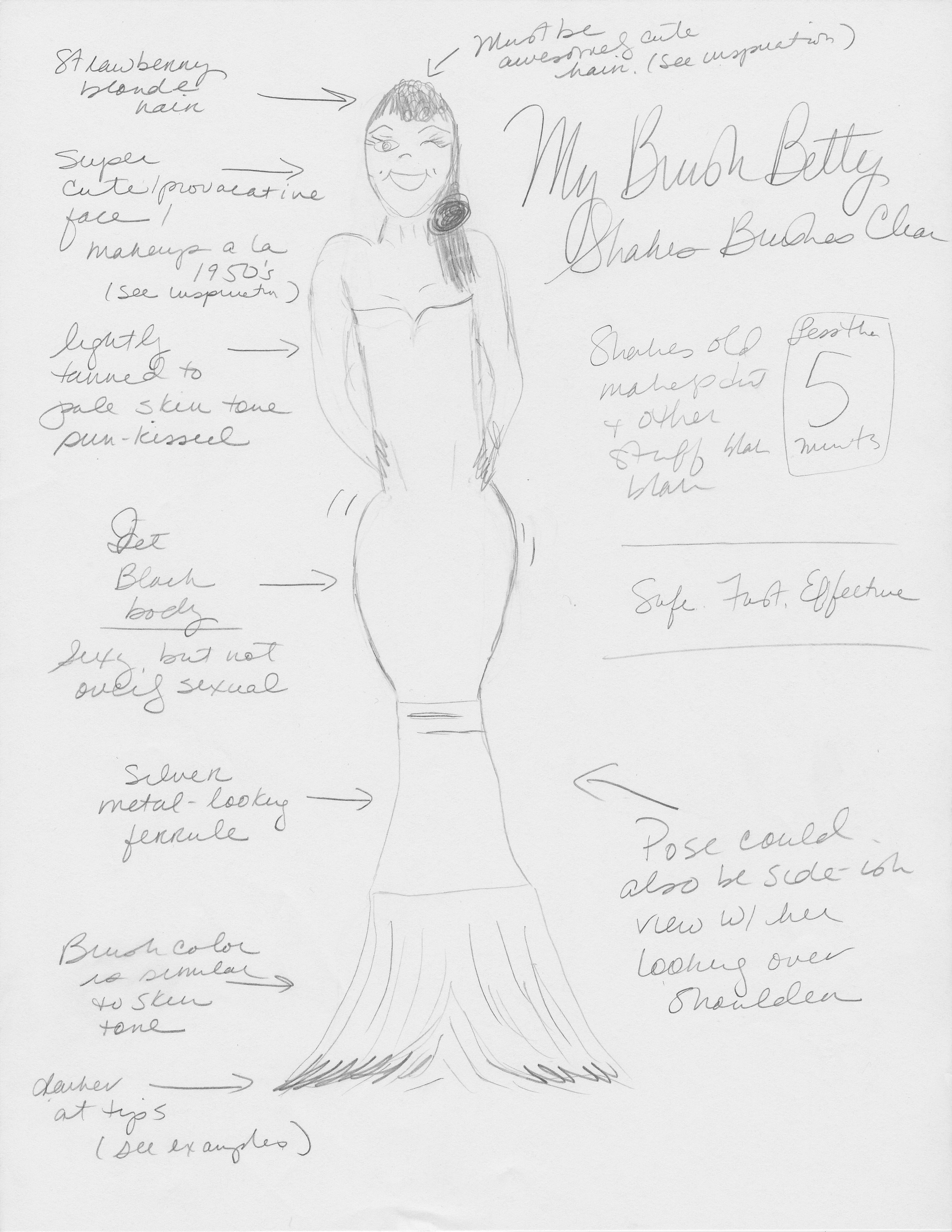
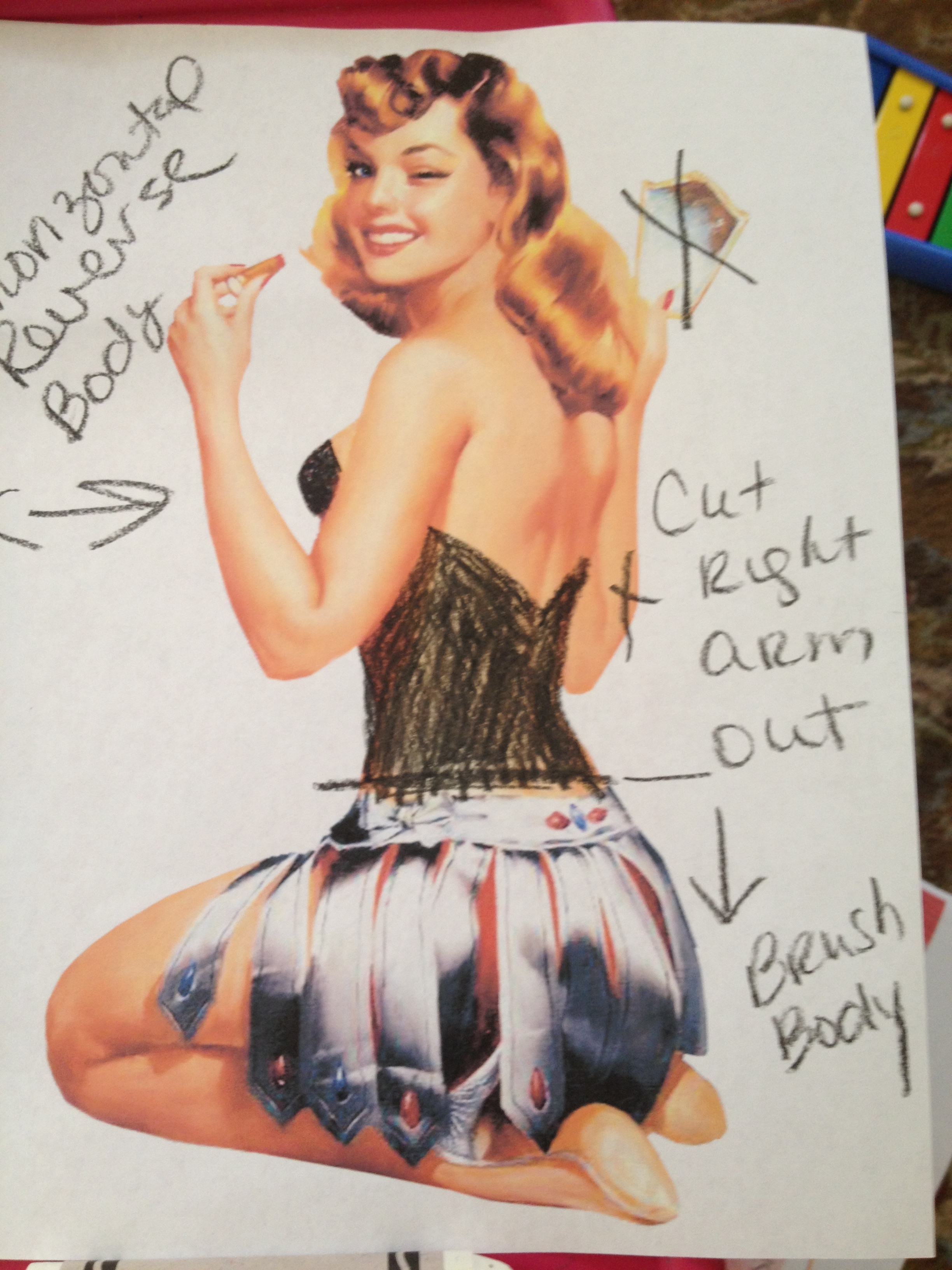
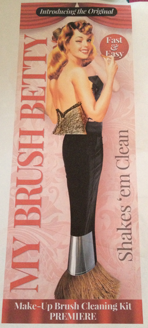
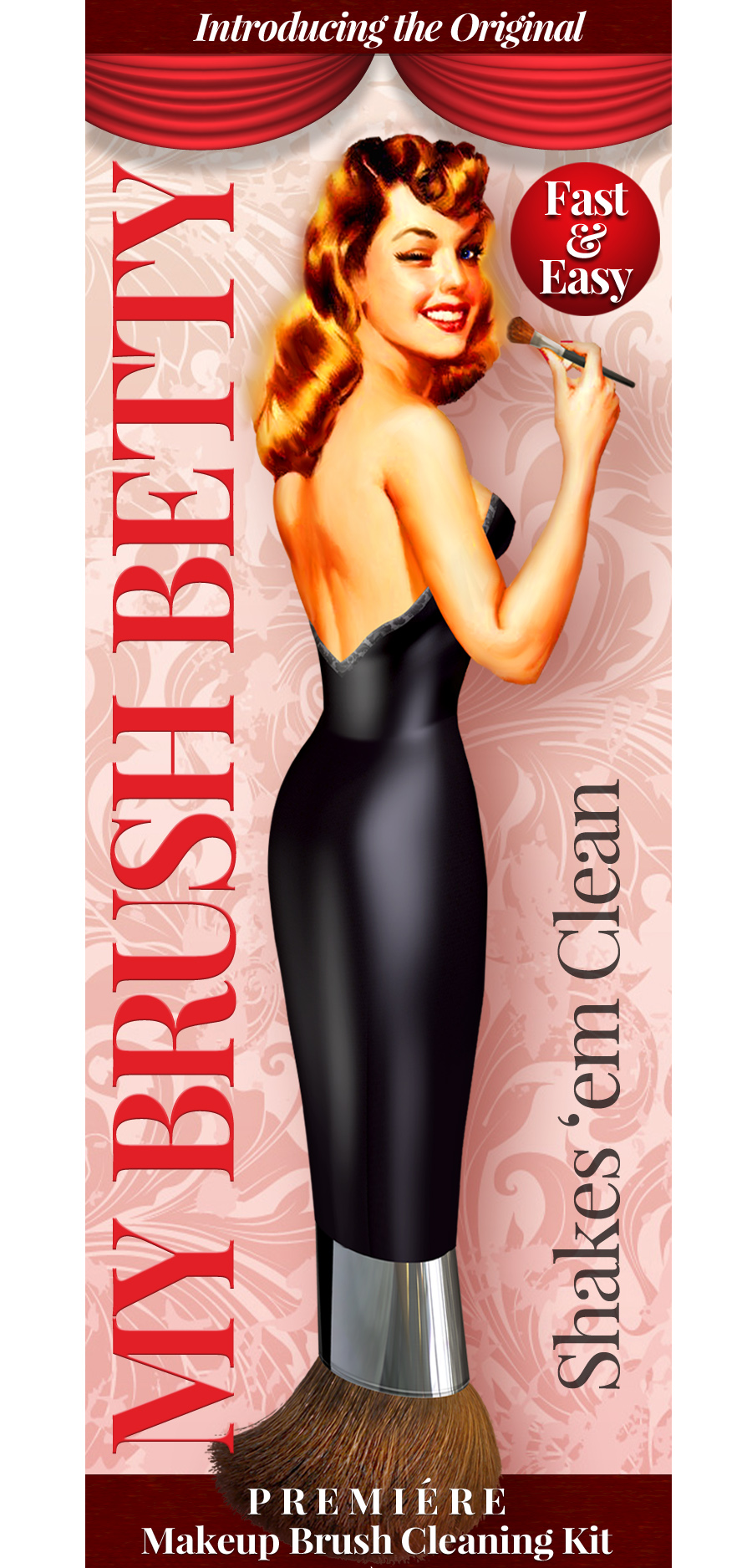
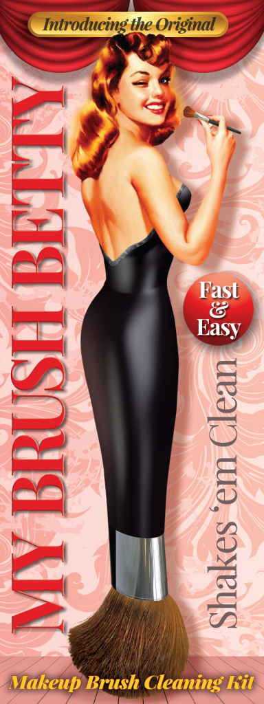
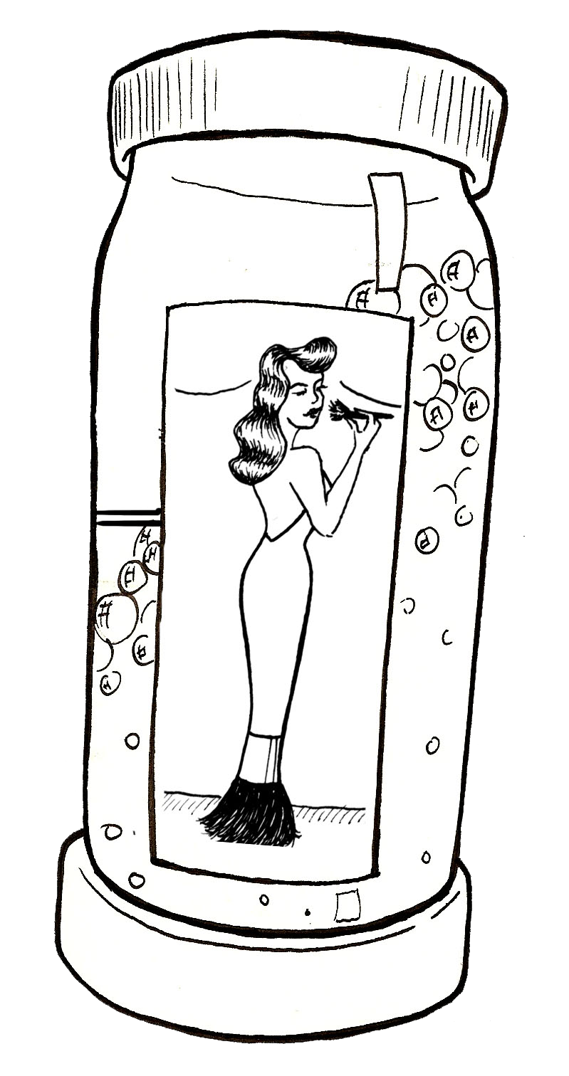
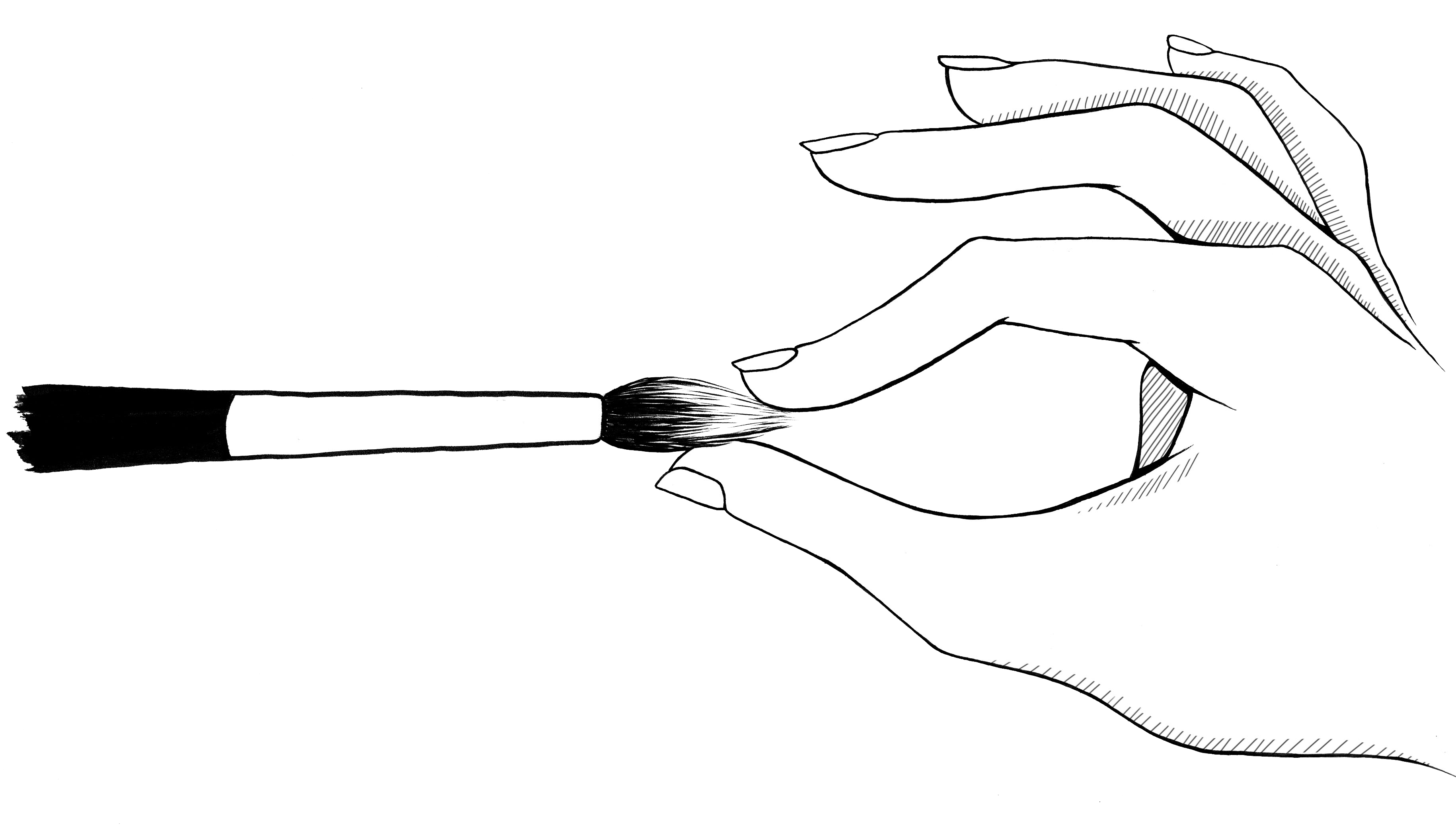
But the thing that really nailed down My Brush Betty was when I came up with the concept of turning the logo into more of a mascot–a pretty lady whose body was actually a full blown makeup brush.
At home, we were just starting to go through a phase of watching a lot of “The Little Mermaid,” since my daughter was just over 1 year old. And one night, quite literally in the middle of the night, the idea of making an actual makeup brush lady hit me. Sort of like a mermaid. I got up and started using my daughter’s crayons to sketch out a makeup brush figurine.
My husband, of course, had thought I had totally lost my mind (even more than he already did).
“What are you doing?” he asked as I scribbled away in the dim light …
“Why, my dearest, I’m creating an old-fashioned product mascot …”
And I really thought it was a good idea. It was cute and “sticky,” the kind of thing people wouldn’t easily forget.
But now I had to find an artist to pull it off.
Good Artists Are Expensive
In the good old days of newspapers, we worked with big teams of spectacular artists who illustrated our stories, and I knew just the one for this project: Rick Nease, with whom I worked for years at the Detroit Free Press.
If Rick thought I was crazy when I asked him to create a woman that looked like a makeup brush, he didn’t say so. But I’m pretty sure he did.
It always takes a few go-rounds on something like this, and you can see some (not even all!) of the versions to the right here. One was too weird. Another was too skinny. We had trouble getting the colors just right on another. …
At one point my cousin Michelle Tanguay, a successful Detroit artist, also pitched in with a version or two.
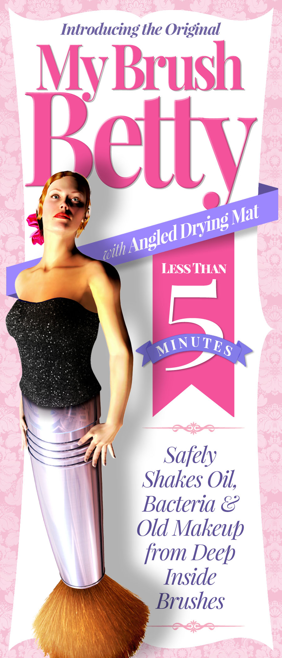
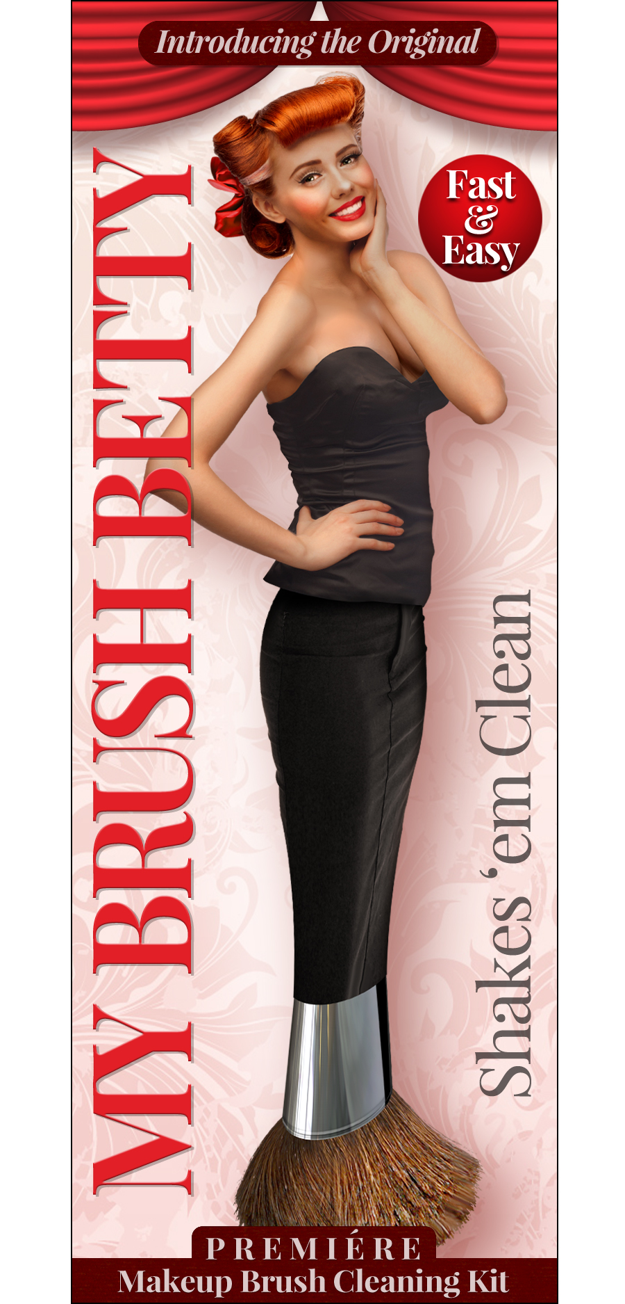
But I was still searching for what felt right. … Eventually, I found a clip sheet of commercial art for pinup girls on Etsy, and I really got stuck on one lady’s face because she just felt right to me. She was also winking, which was sassy and so it fit with the brand promise I was going for.
Sidenote: In buying my clip sheet of commercial pinup girls, I also noticed that one of the adapted ladies is also featured on Valentine Vokda, which is also distilled in Ferndale, MI, and it felt like a good omen to me!
And so Rick began working with her for a final art product. In the end, I was very, very happy with my Brush Betty!
And so then we were in the final stretch. Except …
More Complimentary Creative!
Creative imagery is very important to setting the right tone for a brand, and I wanted a look for some other marketing materials for My Brush Betty that was complimentary to the main Betty image but had a little different look.
 I wanted what I described to my next artist, the young and talented Haley Stone, as French-feeling product illustrations. Pretty sketches that looked like they were elegantly drawn on the back of a napkin.
Haley had this cool art project, the Periodic Table of Ladies, which really won me over for its female-power-ness and the style was spot on.
And so I reached out to her and she did all of the sketch illustrations you’ll find everywhere in the My Brush Betty materials, from bubbles to the container to the mat and everything else in between.
It’s safe to say that I engaged Haley on the marketing materials intermittently throughout this entire process.
Did I mention how much I love art and artists?
While I’m perfectly sure I drove them all crazy with little requests and adjustments, I just loved working with them to get the final result. And I was super excited to share it.
It’s also worth noting that artwork is the one part of my budget that I totally blew up over my initial plan — and it was totally worth it. Because I was super-happy with the result.
After the main imagery was settled on, by the end of summer 2013, I started using the top half of My Brush Betty on the blog. I decided that I would not reveal her whole brush body until I was ready to launch the product.
I also decided I needed to protect the My Brush Betty brush-lady imagery, so my attorney Karin filed for a trademark. More moolah out the door!
By Sarah A. Webster
Founder
My Brush Betty
Click Images Below to See Larger
![]()